Search Knowledge Base by Keyword
-
HOW TO START WITH LABCOLLECTOR
- How does LabCollector interface look like?
- How does a module generally look like?
- How to set up storage in LabCollector?
- What are fields in LabCollector?
- What are records in LabCollector & how to create them?
- How to start with Antibodies module?
- How to start with Chemical structures module?
- How to start with Document module?
- How to start with Electronic Lab Notebook (ELN)?
- How to start with Equipment module?
- How to start with Plasmids module?
- How to start with Primers module?
- How to start with Reagent & Supplies module?
- How to start with Sample module?
- How to start with Sequences module?
- How to start with Strains & Cells module?
- How to use Webinars add-on?
- How to mass update memorized records?
- How to use LabCollector for COVID-19 testing?
- Show all articles ( 4 ) Collapse Articles
-
INSTALLATION
- How can I connect to LabCollector from another computer?
- LabCollector Installation Requirements for AWS
- How to install LabCollector using Docker?
-
- How to move a whole installation to a new Windows server?
- How to run LabCollector server on a 64bits Windows machine?
- Install LabCollector with IIS on Windows Server
-
- Clean the apache log manually to improve the speed.
- Switching to the ServerManager v2.5 (old way)
- Windows Installation Using Setup Wizard
- How to enable the soap.dll extension in LSMRemote using php file or LabCollector Server Manager (Windows)?
- How to use the LabCollector Server Manager?
- How to replicate LabCollector in real time with Windows Server Manager?
-
- Apache Server/Web server doesn't run on Windows 10
- Clean the apache log manually to improve the speed.
- Clean the logs manually to improve the speed.
- ERROR in log: AH00052: child pid 3461 exit signal Segmentation fault (11)
- ERROR: Warning: mysql_connect(): Client does not support authentication protocol requested by server (…)
- How to make Java applets work again after upgrading to Java 7U51+?
- How to restore overwritten documents
- I have the message "Failed to connect to mySQL server. No Database found for this lab account". What can I do?
- My LabCollector or Add-on is very slow. Why and how to fix it?
- Unknown column “auto_name_mode” in “field list”: The error is occurring when I want to adjust existing records, make new records or import data. What can I do?
- URL issue
- When I add records or any values I have this message: "incorrect integer value: for column 'count' at row 1"
-
- Give access to LabCollector to collaborators outside your network
- How can I connect to LabCollector from another computer?
- Can the database be separated from the system on which labcollector is installed?
- I have problems installing PHP and/or MySQL. Is there an alternative?
- Mysql Server memory usage optimization
- PHP extensions needed
- Rack scanners installation and connection with ScanServer
- System Requirements - Hosted options (FR/ENG)
- What are PHP and MySQL? Do I need to have PHP & MySQL?
- How to migrate LabCollector to new Linux Server?
-
GENERAL
- What is LabCollector?
- How do I install LabCollector? Where can I find the install.exe file?
- System Requirements - Hosted options (FR/ENG)
- How does the remotely hosted version work?
- Can I use LabCollector on a single computer? Can I install it on a web server?
- If I purchase ONE license, do I need to purchase additional licenses for other computers in my lab network?
- Client Area Tutorial
- LabCollector support
- What are the FDA requirements for software to comply with GxP guidelines?
- Do I need to purchase all modules? Can I use only the primers module?
- Icons meaning (EN/FR) V.6.0
- Icons meaning (EN/FR)
- How do I search in LabCollector?
- Can I see/list all records in a module?
- How do I print records?
- How to add panels to LabColletor v6.0?
- How to create tubes with storage and mark their usage? (v6.0)
- How to create and set alerts for tubes? (v6.0)
- Label network printers and roll types
- Show all articles ( 4 ) Collapse Articles
-
BASIC FEATURES
- Export and print models
- How do I add multiple records without data import
- How do I link records and for what purpose?
- How do you create or edit records? (FR/EN)
- Icons meaning (EN/FR)
- Icons meaning (EN/FR) V.6.0
-
- What can I do with the default fields?
- Can I add a custom module to fit my specific needs?
- Custom field types
- How do you create a custom field?
- How do you create a custom field? For version 5.2 onwards
- Custom field: Field category option version 5.2x
- Custom fields: Tab Analysis option
- How do I customize record options?
- How do I use a Read-only field?
- How to customize LabCollector login page colors?
- How to change the language & name of custom fields?
-
- What is a CSV file?
- Import your data (v6.0)
- Import your data (5.3 version and above)
- How to delimit data csv for data import?
- What are the default fields values while importing data? v6.0
- How do I format the date value as yyyy-mm-dd or yy-mm-dd to import?
- Import your samples and associated storage in 3 steps
- Import and manage your Reagent & Supplies V5.3 and above
- Importer ma BDD EndNote dans LabCollector (FR)
- How to solve errors while importing data
- How to mass update memorized records?
-
- What are user level permissions?
- How do you use versioning? v5.31 and below
- How do you use versioning? v5.4 and above
- How to manage users (v5.31 and below)
- How to manage users (v5.4 and above)
- How to use AD or LDAP for login authentication?
- What are group policies and how to use them?
- What are group policies and how to use them? v5.4 and above
- What are group policies and how to use them? v6.0 and above
- How to manage users? (v.6.032+)
- How to configure access permissions?
-
MODULES
-
- Articles coming soon
-
- How to start with Reagent & Supplies module?
- Reagent & supplies preferences (v6.03)
- Reagent & supplies preferences
- How do I create alerts for chemical and equipment?
- How do I create alerts with lots? (v6.0)
- Manage your reagent lots (v6.0)
- Manage your reagent lots
- How to dispose of a lot?
- Risk codes
- How do I manage vendors and sellers?
- How do I print risk and safety data information?
- Import and manage your Reagent & Supplies V5.3 and above
- Manage storage for Reagent & Supplies module
- Manage storage for Reagent & Supplies module (v6.0)
- GHS Hazard Pictograms, Mandatory Safety Signs and the NFPA Hazard Rating System
- How to Use SDS Maker?
- Show all articles ( 1 ) Collapse Articles
-
- Articles coming soon
-
- Articles coming soon
-
- How do I create alerts for chemical and equipment?
- How to activate and set different types of Equipment alerts? (v6.0)
- How to activate and set different types of Equipment alerts? (v5.4 and below)
- How to add a new category and record in equipment module? (v6.0)
- How to add a new category and record in equipment module? (v5.4 and below)
- How to add control chart for calibration maintenance of equipment?
- How to Add/Edit Maintenance for Equipment? (v6.0+)
- How to add/edit maintenance for equipment (v5.4 and below)
- How to export equipment maintenance report?
- What are the options in "display maintenance" section of equipment. (v5.4 and below)
- What are the options in "display maintenance" section of equipment. (v6.0)
-
- Articles coming soon
-
ADD-ONS
- What are Add-ons?
- Fly Stock Manager
- What's Weight Tracker Add-On? How To Use It?
- Custom Field File Upload
- What is e-catalog add-on? And how to use it?
-
- How to start with LSM?
- LSM Usage Guide – From Job Request to Results Reporting
- Test the LSM API
- Insert the LSMremote application in your website
- How to Perform a Paternity/Relationship Genetic Test using LSM?
- Introduction to HL7 and how to use it in LSM
- LSM Job List Icons - What do they mean?
- LSM: How to Group Test Results by Specialty?
- Lot-Sample Linking in LSM for Quality Control
-
- 1st step: Create users and requesters
- How to send samples from LabCollector to a LSM job
- How to link a custom module to LSM?
- How to manage case records (patients, animals...) in LSM?
- How to re-order/re-arrange job & sample custom fields in LSM?
- How to manage ranges in LSM?
- How to restart a job in LSM?
- I’m able to add a new job with no problems but when I try to start it I can’t do it. The following error appears: Error loading XML document: data/bl/bl-job.php. What’s the problem?
- How to accept jobs in LSM?
- How to create & execute a job in LSM?
- How to create version of test in LSM?
- How to import CSV with samples and tests in LSM?
-
- 5th step: Result and invoice template
- How to generate Reports in LSM?
- How to create a processing report in LSM?
- How to Generate Invoices Report Template in LSM?
- How to create a Chain Of Custody (CoC) report and use it LSM & LSMRemote?
- How to use text editor to create a report template in LSM?
- Report tags in LSM for result/invoice/CoC/batch templates?
- Correction/Amendement actions in LSM report
- How to print and follow multiple reports/CoC's in LSMRemote?
- Error loading big reports in LabCollector
- Error loading big reports in LSM
- How to configure header & footer in LSM report/CoC/invoices? (from v4.057+)
- What's the purpose of the report unique ID barcode?
-
- LSMRemote (v6.0) registration, login and other options
- LSMRemote installation steps & Integration into the website ? (v4.0)
- LSMRemote configurable options (v4.0)
- How to configure new fields, submit a job in LSMRemote & view it in LSM?
- How to search in LSMRemote?
- How to create a token for report access for patient/client using LSMRemote?
- How to generate CoC Manifest with integrated labels?
- How to print and follow multiple reports/CoC's in LSMRemote?
- Patient pre-registration configuration and LSMRemote portal connection
- How to do job pre-registration from the LSMRemote portal?
- How to integrate appointments scheduling in LSMRemote?
- How to enable the soap.dll extension in LSMRemote using php file or LabCollector Server Manager (Windows)?
- How to import jobs using LSMRemote?
- How to configure kit and activate it in LSMRemote?
- How to print in bulk the barcodes using LSMRemote?
-
- OW-Server ENET manual
- OW-Server Quick start guide
- OW-Server WiFi manual
- Quick WiFi configuration for OW-Server WiFi
- Conversion method from mA reads to specific Unit for data logger probe?
- How to setup your Data Logger in LabCollector?
- How to Install Sensors on ULT Freezers?
- How to Setup Alerts in Data Logger?
-
-
- How to create a Book, add an Experiment and a Page?
- What is inside a Book?
- What is inside an Experiment?
- Whats inside ELN Page?
- How do I print from ELN?
- ELN Workflows
- ELN templates
- TIFF Image usage
- How to electronically sign the ELN pages?
- How to add a microplate in ELN Page?
- How to add a reagents/solutions recipe in ELN?
-
- ELN - Zoho Spreadsheet Help Guide
- Graph in Flat spreadsheet
- How to change the language of ZOHO excel in ELN?
- How to replicate/import your excel in ELN?
- How to use spreadsheets?
- What is Flat & Zoho Spreadsheet Editor & how to enable it?
- How to use Flat spreadsheet & formulas in it?
- How to make graph in Flat Spreadsheet?
- What can be copy pasted from excel into Flat spreadsheet?
-
- Sample-receiving add-on : Project configuration settings
- How to create & process a package in Sample receiving add-on?
- How to perform pooling in sample receiving add on?
- How to process plates in sample receiving add-on?
- How to view samples created in sample receiving add-on into a module?
- How to add samples created in sample receiving into Workflow add-on?
- How to connect and send samples from 'sample receiving' to do tests in 'LSM'?
-
MOBILE APPS
-
INTEGRATION
-
API
- Introduction to LabCollector API
- API for LabCollector (v5.4+)
- API for LSM (v2)
- API for ELN (v1)
- How to test the LabCollector REST API?
- API error messages
- API: How to create boxes or plates?
- Test the Lab Service Manager API
- Webservice/API Apache setup
- How to set up your Web Services API?
- What's Swagger UI? How to access it & test out API endpoints?
-
TOOLS
- How do you install NCBI blast executable to use in LabCollector?
- How to setup and use Recipe Manager (old version)
- How to manage memorized items?
- Purchase order management - A to Z
- Purchase order management – A to Z (v 6.0+)
- Recipe Manager (v6.0)
- Samples batch tool (Rack scanner)
- How to use Mass Record Updater?
-
UTILITIES / MIDDLEWARE
-
- How to download and Install File connector v2.2? (Labcollector v6.0 )
- How to install Fileconnector in Mac OS? (Labcollector v6.0 )
- Editing a file using File Connector
- How to use a specific software to open certain types of files in fileconnector? (Labcollector v6.0 )
- How to use Fileconnector in Mac OS?
-
- How to setup and configure Scan Server with LabCollector?
- Samples batch tool (Rack scanner)
- The rack barcode on top or as third element in lines?
- How to open CSV in UTF8 in Excel?
-
PRINTING
- How to configure printer with LabCollector?
- How to connect USB printer to LabCollector?
- Compatible Label printers
- Label network printers and roll types
- Barcode label generation and printing
- How do I print barcode labels?
- How do I print box maps?
- How do I print records?
- How do I print risk and safety data information?
- How do I print storage records
- How to print labels on HTTPS environment?
- How to best configure your PDA N5000 for LabCollector use
- How can I configure my barcode scanner AGB-SC1 CCD?
- How can I configure my barcode scanner HR200C ?
- How do I configure FluidX to support ScanServer?
- Barcode Printer Connection Time Out
- AGB-W8X Manual for barcode scanning
- How to set up your Printers & Labels?
- Show all articles ( 3 ) Collapse Articles
-
STORAGE
- How to set up storage in LabCollector?
- How to create boxes/drawers/racks in storage equipment?
- How to create box models for storage?
- How to replicate and duplicate boxes in storage?
- How to store and manage straws? (EN/FR)
- How Do I Add Samples to a Specific Freezer, Shelf or Other Part of the Storage System?
- How do I get out samples from a specific freezer?
- Manage storage for Reagent & Supplies module
- How to organize Storage Browser?
- How do I print box maps?
- How do I print storage records
- Storage Check-in/out System
-
COMPLIANCY
- What is in the Compliancy Pack?
- How do I use a Read-only field?
- What are the FDA requirements for software to comply with GxP guidelines?
- FDA CFR21 part 11 product checklist
- ISO 17025 compliancy requirements
- How do you use versioning? v5.31 and below
- How do you use versioning? v5.4 and above
- Should I lock, archive or delete records?
-
SUPPORT
-
SETTINGS
- How to configure Apache to work with Office 2007 and higher?
- How to speed up your LabCollector? (EN/FR)
- PHP extensions needed
- Speed your local network
- TIFF Image usage
- Time stamp in the records showing incorrect time.
- How to configure SMTP to use OAuth 2.0 (Microsoft & Gmail)?
-
- LabCollector General setup
- LabCollector General setup - v5.4
- LabCollector General Setup 5.2
- LabCollector General setup-v6.0
- Login Options & php requirements for LDAP/SSO
- How to set up your LabCollector's general settings, logo & modules' names?
- How to configure your Proxy, Task Scheduler and Email options?
- How to configure your module search & form options?
- How to configure your Homepage external links?
- How to set up your News Feed?
-
- Error loading big reports in LabCollector
- Fields with scroll bar don't work with Safari, what can I do?
- I can't manage to view box scheme in Safari, why?
- I get the error: "The program can't start because MSVCR110.dll is missing from your computer. Try reinstalling the program to fix this problem" when installing or updating LabCollector for Windows
- Issue in upload file: look at your PHP configuration
- Module search fails with 404 error or request too long
- When I want to import large files, nothing happens?
- Why do I have the error “MySQL server has gone away” on file upload?
-
NEW KB OF THE MONTH
-
RECORDED PRESENTATIONS
How to make Control Charts?
Control charts help us monitor quality. It is one of the seven basic tools described for quality control. Such charts can be used to determine if the process/equipment is stable over time. Control charts help to keep a check on the performance of the instrument by using a QC/QA (Quality Control/ Quality Analysis) sample.
A control chart always has three lines for reference:
1. The Central line for average
2. The Upper line for upper control limit
3. The Lower line for lower control limit
Based on these lines and the data plotted you can check if the equipment performance is consistent, which is in control or variable that is out of control.
Our LSM uses Control Charts to access the performance of the Equipment and the Data trending chart for the performance of the Sample. Moreover, the LSM plots a Graph that is evaluated via a 6-Sigma approach (explained in below).
Create control charts
Go to LSM–>Home–>Control Charts and click on ‘Add a new Chart’
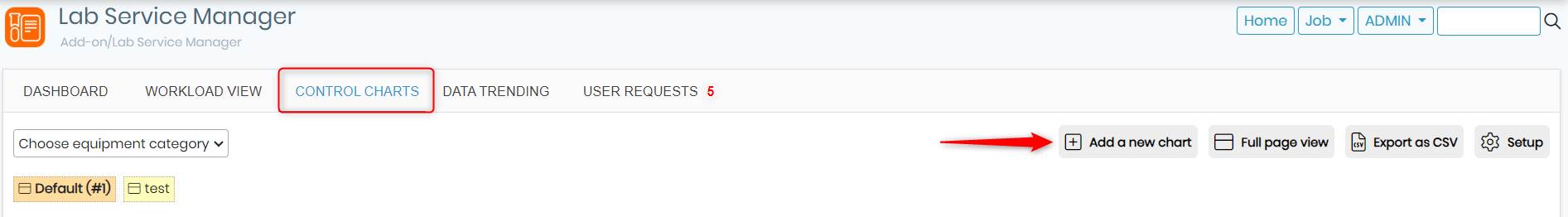
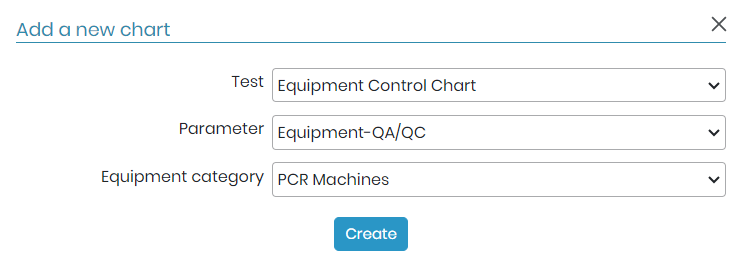
A pop-up box will appear where will have to select one by one the Test, Parameter & Equipment.
The options that will appear in the drop-down list will be the samples that are marked as QC/QA.
The chart will appear as below.
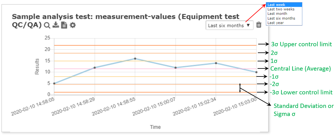
- The tile of the chart represents the TEST name, Parameters & the Equipment name.
- In the chart the Y-axis represent results values which are automatically created.
- The X-axis represents the date and time in Hours:Minutes:Seconds of creation on the results.
- The chart can be chosen to represent values from either last two weeks to last year.
- You can download the graph as a PNG image by clicking the download sign
 .
. - The
 magnifies the graph to the full or biggest size.
 - You can download the graph values in CSV file by clicking on this icon
 . *NEW LSM v3.2171
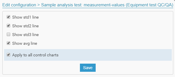
 - By click on the
 icon you can now have the choice to select which standard deviation bar you want to show in your graph and edit the configuration as per your requirements. You can also apply the setting to all of your graphs by checking the box in front of “Apply to all data trending charts”. Once you are finished you can save the settings. *NEW LSM v3.2171
- The colored lines represent the sigma values (6σ) that is the standard deviation. The more number of standard deviations between process average and acceptable process limits fits, the less likely that the process performs beyond the acceptable process limits, and it causes a defect. This is the reason why a 6σ (Six Sigma) process performs better than 1σ, 2σ, 3σ, 4σ, 5σ processes. The detailed explanation of standard deviation in the chart is shown above (green).
![]()
To make a control chart to check the performance of the equipment using LSM add-on, you need to follow certain steps described below.
Step 1. Adding equipment
Go to LSM–>Admin–>Equipment. Click on Add to insert an equipment.
(You can also click the link to see in details on how to add Equipment)
You can add the category of the equipment as well. For example, if you are a research lab and have different PCR (polymerase chain reaction) machines and you want to check the performance of the equipment over time using control charts.For this situation, you can to add the equipment category as PCR machines and the name of the equipment can be Bio-Rad or Thermoscientific, etc. depending on the company or the type of machine.
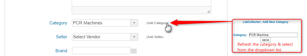
Fill the required details and click save. This equipment is added in the LSM equipment list.
![]()
Step 2. Creating Parameters
Go to LSM–>Admin–>Preferences->Parameters. Click on Add parameters.
(You can also click the link to see in details on how to add Parameters)
You can add the parameters as required.
![]() Remember to put the “level” as Test and “data Type” as Numeric.
Remember to put the “level” as Test and “data Type” as Numeric.
![]()
Step 3. Creating Tests
Go to LSM–>Admin–>Preferences–>Tests. Click on Add Test.
(You can also click the link to see in details on how to add tests)
Add the details as required.
![]() Important step is to put the equipment that will be used for test. This equipment’s performance will be accessed using control charts.
Important step is to put the equipment that will be used for test. This equipment’s performance will be accessed using control charts.
![]() Take care that the equipment is not in maintenance and is operational with a contract and warranty.
Take care that the equipment is not in maintenance and is operational with a contract and warranty.
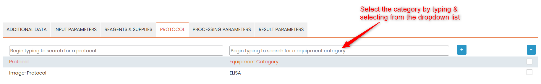
To insert the equipment, go to protocols and insert the Equipment category and then click on the plus sign to insert.
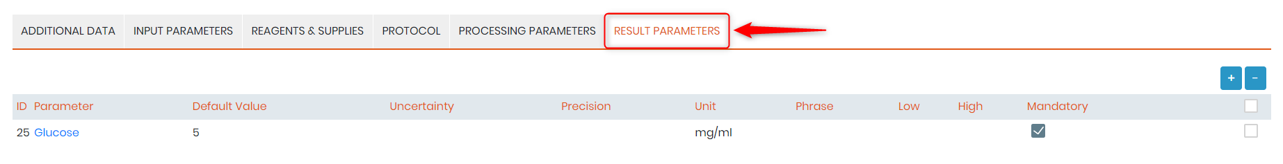
Input the required Input, processing and result parameters and their respective ranges. For example, see below.
The parameter that we saved in step 2 will appear in the drop-down. Then click on + sign to add the results parameter. Save the test.
![]()
Step 4. Creating a Job
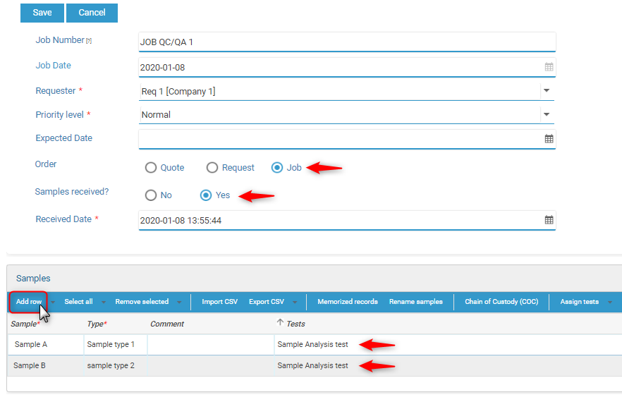
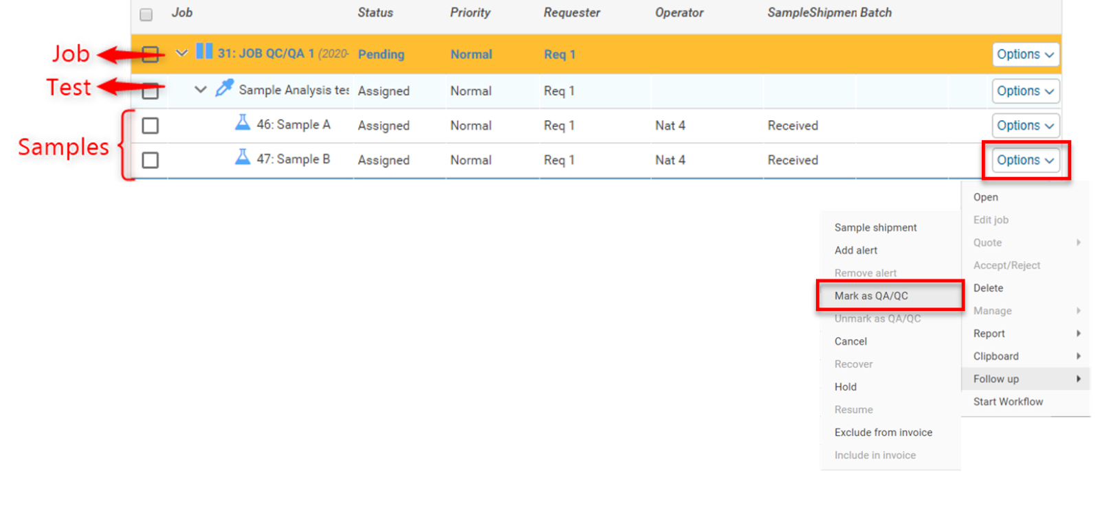
Go to LSM–>Job–>Add Job.
Fill the required fields. Set the order to “Job”, select the samples received “Yes”. After that click on “Add Row”. Add the Sample, type and the tests and then click on “Save”.
Click on the “Options” at the sample level–>Follow-up–>Mark as QC/QA
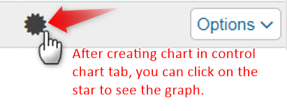
Once marked as QC/QA a black star will appear in front of the samples. After creating the charts you can click on this image to see the chart.
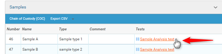
After this, Click on the “Options” at the Job level and select ‘Open’. A pop-up will open with the job details. Under the Sample click on the test name.
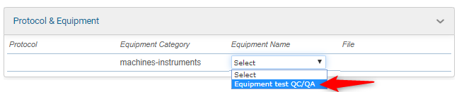
When you click on the test name the below pop-up will appear where you need to select the equipment under ‘Protocol & Equipment.
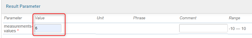
Once you “Save & Start” the job status will move from ‘Assigned’ to ‘Started’. You can fill the measurements that you want to fill in results tab example like below image.
Under the Result Parameter add the ‘Value’ obtained during the test.
Once the Job is completed, and after it is ‘Validated’ the status of the Job will be seen as Approved.
![]() The job needs to be completed and approved for the Control Data chart creation.
The job needs to be completed and approved for the Control Data chart creation.
After all steps are completed you can create the chart as described above.
![]()
Related topics:
- Check our KB on LabCollector’s linux requirements and installation.
- Check out our Introduction to LabCollector API.
- Read our KB on LabCollector installation requirements for AWS.
