4.5 Control Chart
Control chart allows you to do quality check/calibration tests on the equipment and then plot a graph based on their performance.
Please read the knowledge base  KB: how to create control charts.
You can just drag and drop charts and arrange them as you prefer.

Interface:
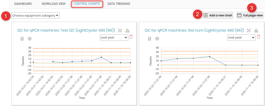
- You can even create graphs pages dedicated to the equipment category. You can create equipment category in the Equipment module.
Please read the knowledgebaseKB: how to use equipment module - To add a new chart you can click on this option.
- You can see the chart page in a full page view.
For each graph you will see various options.

- You can expand the graph size by clicking this option.
- A png image file can be downloaded using this option.
- A CSV file containing the standard deviation values (automatically calculated based on values of results from tests), min and max values and the values according to tests done on various dates.
- This option allow you to choose the standard deviation lines, average line to be visible or not in the graph. You can also apply these settings to all the charts.

- You can select the timeline that you want the graph to show.
- You can delete the graph if you want.